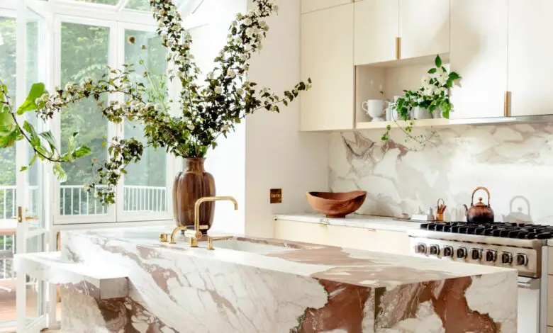
Even the tidiest spaces can can benefit from some kitchen layout ideas. Sure, not all of us can manifest a window (and requisite dreamy landscape) in front of our kitchen sinks, or install a custom range hood in our rental apartments. But fear not: with some clever lighting solutions and playful design elements, we can learn to make the most of what we’ve got. And designer Elizabeth Roberts is here to show us how. With a track record packed with historically sensitive renovations, Roberts and her Brooklyn-based firm are no strangers to working within plenty of constraints. Her philosophy leans into new materials, open and breathable vibes, and joy-inspiring touches—without compromising the character of the kitchen she’s restoring. Here are some of her favorite kitchen layout ideas.
Room With a View
When laying out your kitchen, Roberts advises, “always think about what you want to be looking at.” A sink by the window, for instance, makes washing dishes a scenic experience, whereas a sink on an island allows for interactions with family or guests. Knowing your priorities will determine the placement of key stations.
The Cabinet Conundrum:
“There is always the question of how many upper cabinets to have and where,” Roberts notes, adding that many clients now want to stare at something other than a cupboard when cooking. A single open shelf provides an elegant display for everyday staples while leaving wall space for artwork or sconces.
What’s Center Stage?
“Islands are getting boring,” Roberts says. Rather than matching the cabinetry, she mixes it up with designs sheathed entirely in stone, like the marble one at fashion designer Ulla Johnson’s Brooklyn brownstone. (“I like a big block of something,” Roberts notes.) Other islands have been detailed to look like furniture, with meticulous joinery in the woodwork. For a kitchen on the North Fork of Long Island, she added eight inches to the legs of a vintage farm table to make it counter height.


